Toggles
Toggles let users switch a single option on or off. They are a standard iOS component (see Apple's toggle guidance).
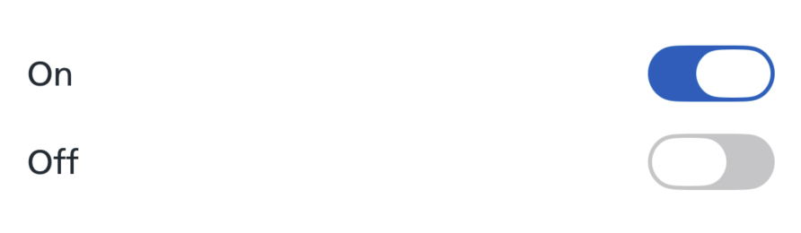
How it works
There is one style, applied with the .nhsToggle preset. It uses the native iOS toggle, tinted NHS blue when on.
How to use
Use a standard SwiftUI Toggle and apply the NHS style with the .toggleStyle(.nhsToggle) modifier.
In a form
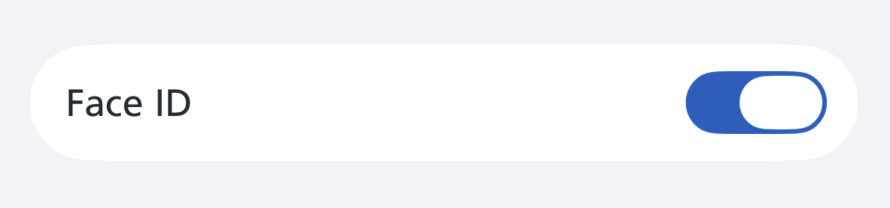
Apply the style to the Form to set it for every toggle inside.
Toggle with a subtitle
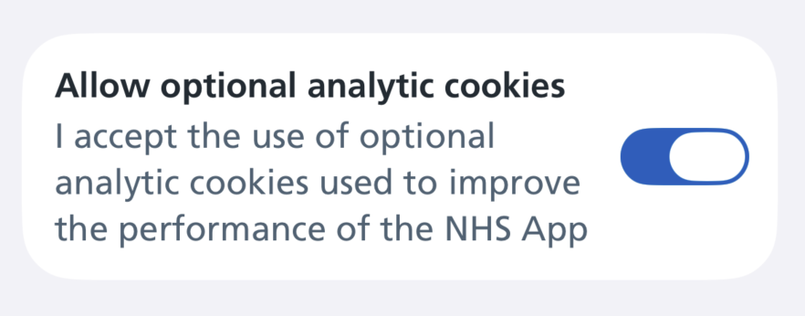
When a toggle needs supporting text, give it a two-part label.
Where a toggle has a subtitle, keep the title short and put the detail in the subtitle, so the on or off state is clear at a glance.
Accessibility
This component supports Dynamic Type, Dark Mode and VoiceOver.
The style keeps the native toggle rather than drawing a custom control, so it inherits the system switch's accessibility, haptics and disabled appearance.
VoiceOver announces the toggle's label and its on or off state. Disabled toggles fade visually but remain in the accessibility tree, so users know the option exists even when it is not available.
On/Off Labels
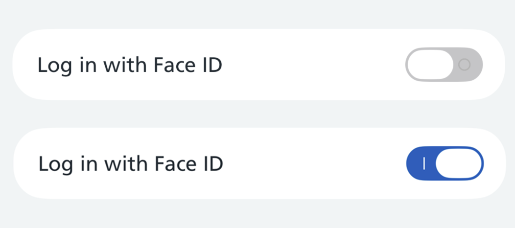
The style also supports the On/Off Labels setting (Settings > Accessibility > Display & Text Size > On/Off Labels). When it is turned on, the toggle shows an "I" when on and an "O" when off, so the state does not rely on colour alone.
Research
This toggle style is not yet being used by the live NHS App, but several rounds of research have been done on them.