Banner
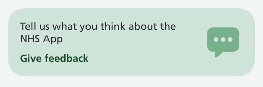
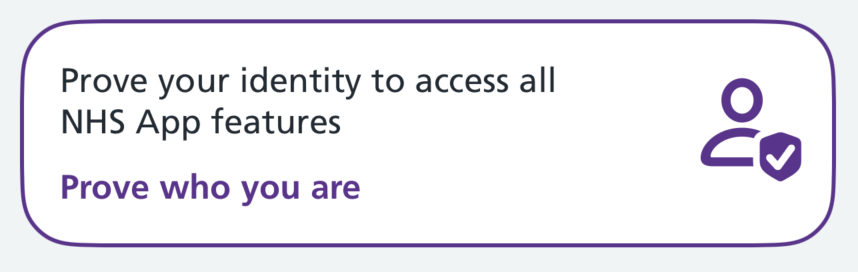
The banner is a highly visible, tappable card that draws attention to an important action, such as proving your identity or giving feedback.
When to use
Use a banner to promote a single important action that the user can choose to take, but does not have to take to continue.
For example:
- asking users to prove who they are so they can access more features
- inviting users to give feedback
Use banners sparingly. The more banners on a screen, the less attention each one gets.
Do not place banners next to each other. If you need more than one on a screen, separate them with other content and put the most important one first. For example, the home screen shows an identity banner at the top and a feedback banner at the bottom.
When not to use
Do not use a banner:
- for information that does not have an action
- to show errors, warnings or the result of something the user just did
- for actions the user must take before they can continue — use the relevant journey or screen instead
How it works
A banner has a short line of text explaining why the user should act, followed by a bold link-style label describing the action. It can also show a decorative icon.
The whole banner is tappable, not just the action label. This gives users a large tap target.
There are 2 styles:
- solid — a coloured background with no border
- outlined — a white background with a coloured border
The layout adapts to the user's settings:
- text scales with Dynamic Type
- at very large text sizes, the icon is no longer shown so the text has more room
How to use
Use the banner within a SwiftUI view.
The banner triggers an action when tapped. Specify this using the action closure. The action can present a sheet, open a link, navigate to another screen, or trigger any other action.
Solid banners
Use the solid style for less important prompts, such as inviting users to give feedback.
Swift options
| Option | Description |
|---|---|
title |
The text explaining why the user should act |
actionLabel |
The label for the action, shown in bold in the accent colour |
style |
The banner style: .solid(background:accent:) or .outlined(_:) |
systemImage |
Optional. The name of an SF Symbols icon to show alongside the text |
accessibilityHint |
Optional. A short description of what happens on tap. This is not visible but is read out by VoiceOver after the banner's text |
action |
The closure to run when the banner is tapped |
Outlined banners
Use the outlined style to give a prompt more emphasis. For example, proving your identity, which unlocks more features.
If you are not sure which style to use, start with solid. Save outlined for the most important prompt on a screen.
This example presents a view as a modal sheet when tapped:
Using a banner in a list view
To place a banner inside a List, apply the nhsCardRowStyle() modifier so it renders edge to edge rather than as a standard inset row:
Writing for this component
Keep the title to a single short sentence explaining the benefit of acting. Say what the user gets, not what the system needs.
Make the action label describe what happens next, starting with a verb. For example, "Give feedback" or "Prove who you are".
Do not use "learn more" or other vague labels. Users should know what will happen before they tap.
The accessibility hint is optional. Only add one if the title and action label do not already make the result of tapping clear. For example, "Give feedback" does not say it opens a web page, so a hint like "Opens in a web browser" helps.
Do not use the hint to repeat the title or action label – VoiceOver reads those already. If you have nothing new to add, leave the hint out.
Follow the NHS content guide for style, voice and tone.
Accessibility
This component supports Dynamic Type, Dark Mode and VoiceOver.
VoiceOver reads the banner as a single button: the title and action label together, followed by the accessibility hint if one is set.
The icon is decorative and is not read out.
The icon scales with the user's text size and is hidden at very large text sizes.
When choosing colours, check that the accent colour has enough contrast against the background colour to meet at least WCAG AA.
Research
These toolbar items are not yet being used by the live NHS App, but several rounds of research have been done on them.