Campaign card
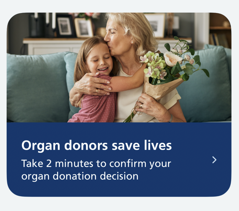
The campaign card is a tappable card that helps users learn about a public health campaign.
When to use
Use a campaign card to promote prioritised public health campaigns that:
- are relevant to most NHS App users
- meet the standards for NHS App integration if they take users to an external campaign website
Use one campaign card per screen at most.
When not to use
Do not use a campaign card:
- to prompt the user to complete a task, such as giving feedback — use the banner
- for information that does not have an onward journey
How it works
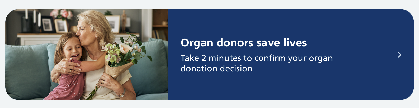
A campaign card has:
- a full-width photograph
- a title in bold
- a subtitle, not in bold
- a chevron showing that the card leads somewhere
The whole card is one tap target. The text sits on a dark blue panel. Text never overlaps the photograph.
The layout adapts to the user's device and settings:
- on narrow screens, the photograph sits above the text
- on wider screens, such as iPad, the photograph sits to the left of the text
- text scales with Dynamic Type
- at large text sizes, the photograph always sits above the text, so the text has the full width of the card
- text is never truncated: the panel grows to fit
How to use
Use the campaign card within a SwiftUI view.
The card triggers an action when tapped. Specify this using the action closure. The action can navigate to another screen, present a sheet, open a link, or trigger any other action.
Swift options
| Option | Description |
|---|---|
image |
The campaign photograph, from your app's asset catalogue. The image is decorative and hidden from VoiceOver |
title |
The heading, shown in bold |
subtitle |
The body text, shown below the heading |
accessibilityHint |
Optional. A short description of what happens on tap, read out by VoiceOver after the card's text. Only set this if the heading and body text do not already make the result of tapping clear |
action |
The closure to run when the card is tapped |
Using a campaign card in a list view
To place a campaign card inside a List, apply the nhsCardRowStyle() modifier so it renders edge to edge rather than as a standard inset row:
Writing for this component
The title should have a persuasive tone. The wording of existing headings or slogans for the campaign can be a helpful reference point. Aim for a maximum of 23 characters including spaces, so the heading fits on one line at standard text sizes. Do not add a full stop.
The subtitle should have an informative tone. It should help users understand what they can do if they follow the link. Aim for a maximum of 75 characters including spaces, so it fits on two lines at standard text sizes. Keep as a single sentence and do not add a full stop.
These character counts are targets, not hard limits. Text is never cut off: at larger text sizes, or with longer text, the card grows. Always check the card at the largest text sizes.
The accessibility hint is optional. Only add one if the heading and body text do not already make the result of tapping clear. For example, if the card opens a web page, a hint like "Opens in a web browser" helps.
Follow the NHS content guide for style, voice and tone.
Accessibility
This component supports Dynamic Type, Dark Mode and VoiceOver.
VoiceOver reads the card as a single button: the heading and body text together, followed by the accessibility hint if one is set.
The photograph is usually decorative rather than informative, so it is hidden from VoiceOver. Check the service manual guidance on alt text to make sure this is right for your image.
The chevron is decorative and is not read out.
At large text sizes the photograph moves above the text, so the text has the full width of the card.
The white text on the dark blue panel meets WCAG AA contrast. Do not place text over the photograph.
Research
In usability testing of this pattern, participants noticed and engaged with the campaign card. They responded positively to the tone of the text, the use of photography, and the idea of campaigns being shown on the home screen.