Card action
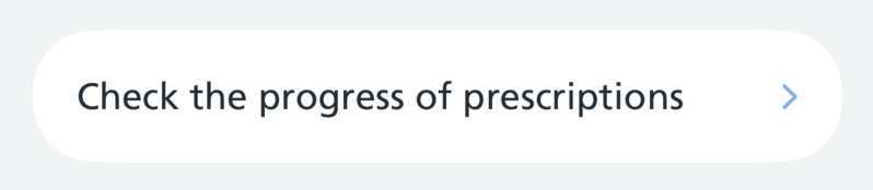
Card actions are tappable rows used to link onwards from a list of options.
How it works
There are 3 styles of a card action:
CardAction's are usually grouped inside a CardActionGroup, which adds the card and the divider between each pair of card actions.
There are 2 card action group styles:
How to use
Swift options
Card action styles
| Option | Description |
|---|---|
.primary |
Body text with a chevron. The default for rows in a group |
.plain |
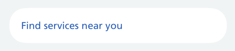
Blue text with no chevron, for rows in a secondary group |
.reverse |
White text with a bold title on a blue card, for a standout row on its own |
Card action group styles
| Option | Description |
|---|---|
.primary |
A white card with no border. The default |
.secondary |
A clear card with a 2pt border, for less emphasis; its rows use the plain style |
Primary
Use the primary style for a card action that leads to another screen or a sheet in the app.
For a single card action outside a group, apply nhsCardStyle() to add a card around it.
Plain
Use the plain style for a card action that needs less emphasis, such as a link out to a web page. It has no chevron.
Reverse
Use the reverse style for a card action on its own that needs to stand out. It has a bold title and white text on a blue card.
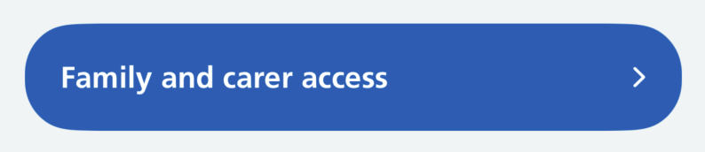
It includes its own card, so don't add nhsCardStyle(). Don't use a reverse card action inside a card action group.
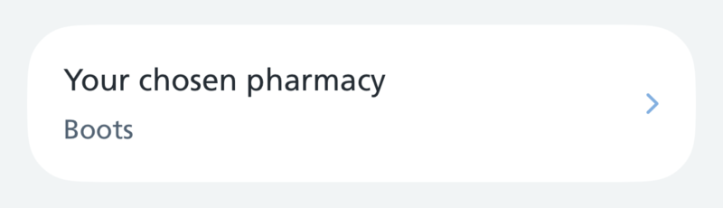
With a subtitle
Add a subtitle for supporting text below the title.
Card action group
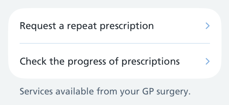
Pass the card actions as an array. The group adds the card and the dividers, so none of that is repeated at each card action.
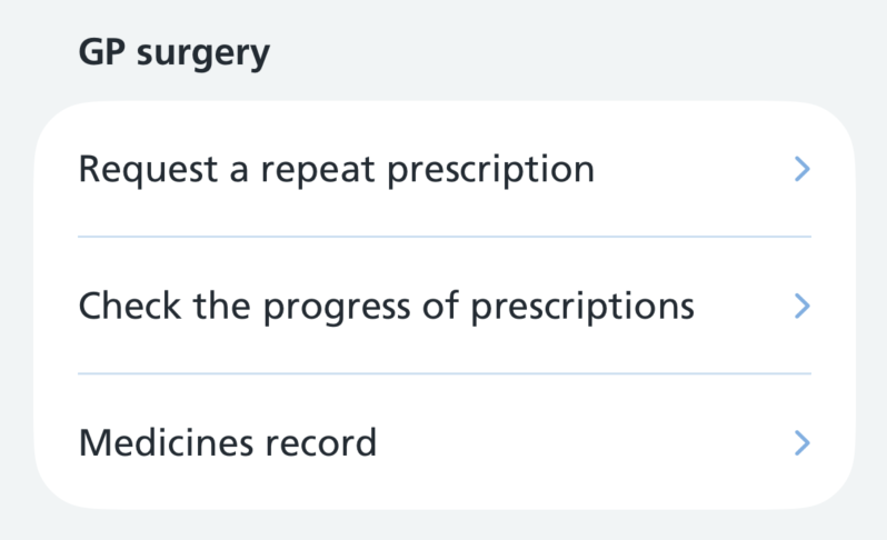
Secondary card action group
For links that need less emphasis, use a secondary group. It adds a bordered card and puts its card actions in the plain style automatically.
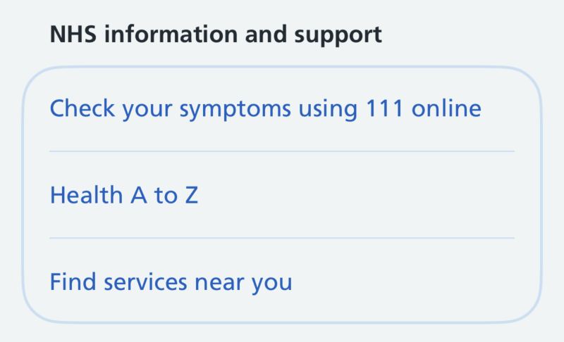
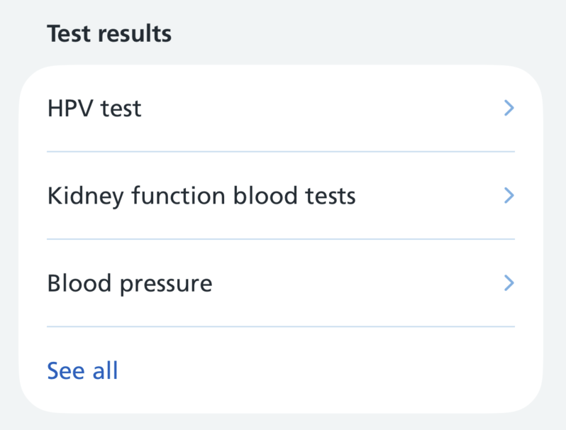
A less prominent action
Mix a plain action into a primary group for one that needs less emphasis than the card actions above it, such as "See all" or "Show more". This has not been tested in research yet.
Header
You can add a header above a group of cards to separate them from other groups on the screen. Keep the header in sentence case.
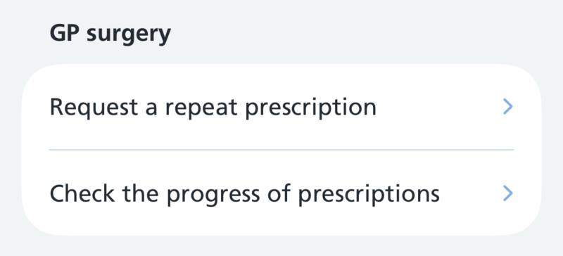
Use a more prominent header, such as a top-level section on a long screen, by passing headerFont: .nhsTitle3.
Footer
You can add a footer below a group of cards to give extra context to them. This has not been tested in research yet.
Accessibility
This component supports Dynamic Type, Dark Mode and VoiceOver.
A card action is announced as a single button, reading out the title and then the subtitle rather than as two separate items.
Where a card action leads somewhere less obvious than a screen in the app, describe what happens in accessibilityHint, for example "Opens in a web browser". A card action that opens a web page inside the app stays a button, because that is how it behaves: it presents something the person closes to come back.
Add the link trait only where the card action really hands the URL to the system, so the person leaves for Safari or another app. VoiceOver then announces it as a link, and it appears in the links rotor:
A group's header is marked up as a heading, so VoiceOver users can find it in the headings rotor.
Research
This component is not yet being used by the live NHS App, but several rounds of research have been done on it.
Using a plain card action for a less prominent action, such as "See all" or "Show more", has been used in a prototype but not yet tested in research. The prototype showed the most recent few items on a hub page, with "See all" going to a list of every item.