Alerts
Use alerts to interrupt users with important, unexpected information, to check how they want to proceed.
When to use
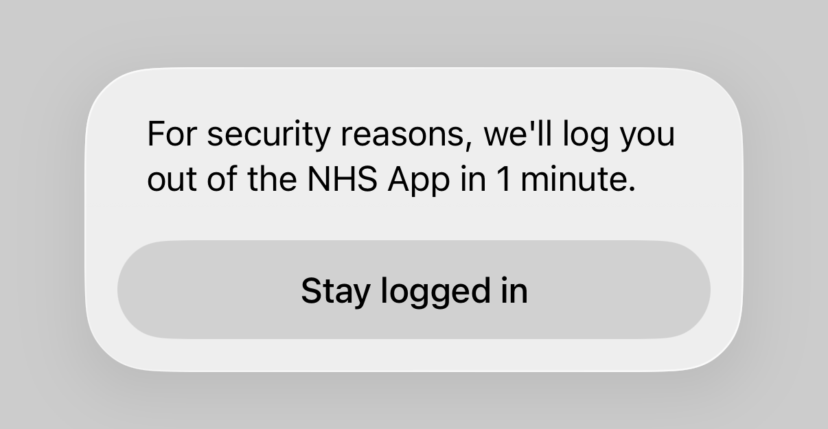
Use alerts when there is critical information users need to know before continuing. This includes when users approach the inactivity time-out limit for the app, to check if they want to stay logged in.
When not to use
Do not use alerts to confirm actions that users have made from a toolbar button. Instead, use the confirmationTitle option to present an action sheet.
Do not use alerts for common actions. Use them sparingly. The more often users encounter alerts, the less likely they are to pay attention to them. Alerts are intentionally disruptive, so using them too frequently will also make journeys harder and longer to complete.
How to use
Alerts consist of:
- a title
- optional informative text
- up to three buttons
Titles should be direct and concise. They should be no longer than two lines, and they should quickly convey what users need to know or decide. Titles are often best phrased as a question.
Use one or two lines of informative text if you need to expand on the title with more details. Use a full sentence with a full stop at the end.
Button text should be one or two words long, and should use a verb, or a verb phrase. Always use “Cancel” for a button that cancels an alert’s action, in keeping with Apple’s alert design guidance.
Affirmative buttons, which confirm the user wants to go ahead, should always be placed on the right-hand side. Cancelling buttons, which dismiss the alert and stay on the current screen, should be placed on the left-hand side.
Use the standard SwiftUI .alert function to present alerts:
Research
Alerts and variations of their content have been included in several research rounds.
For alerts shown on leaving an overlay, some users expected the whole app would close when we tested the title "Exit this service?" with the button text "Exit". Understanding about what would happen next was improved when we tested:
- a generic alternative that could be used for any journey ("Leave this area?" with the button text "Leave")
- alternatives that were specific to particular journeys ("Close this request?" with the button "Close" for the request a repeat prescription journey, and "Close this booking?" for GP appointments)
The difference in user understanding and expected behaviour between these generic and specific options was marginal, but there was a slight improvement when the content was specific. The vast majority of users no longer expected the app to close whether the content was generic or specific.
Since this research, we've iterated our designs towards using action sheets instead of alerts when users leave an overlay.