Title
The title is the main heading of a screen. It can also appear in the toolbar.
When to use
Use a title on every screen, so users know where they are.
When not to use
Do not use a title for headings within a screen. Use a section header instead.
Do not use more than one title on a screen.
How it works
There are 2 display modes:
How to use
Large title
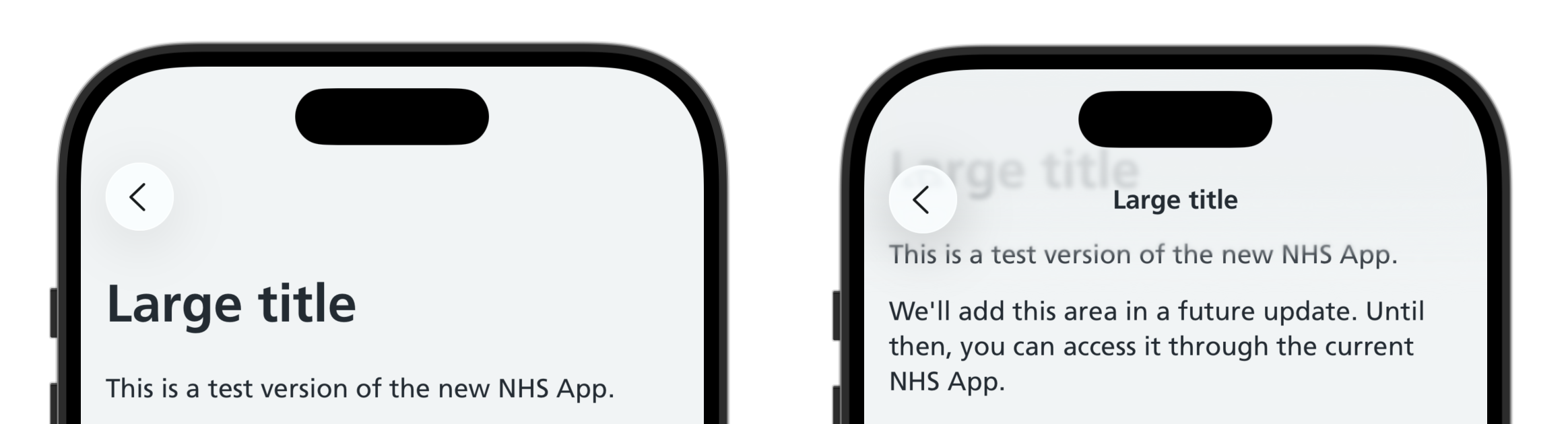
Large titles display at the top of the content, then move into the toolbar as the user scrolls down.
Swift options
Title
| Option | Description |
|---|---|
title |
Optional. The heading. Leave it out to take the heading from nhsTitle(), so the text is written once |
subtitle |
Optional. Supporting text shown below the heading, in secondary text |
systemImage |
Optional. The name of an SF Symbols icon shown to the trailing side of the heading, always in NHS blue |
nhsTitle
| Option | Description |
|---|---|
title |
The screen's heading, in sentence case. Up to iOS 18 this is also the back button label on screens opened from this one |
displayMode |
Optional. .large (the default) shows the heading in the content and in the bar once scrolled past. .inline shows it in the bar only |
Apply nhsTitle() to the screen's scrolling container, and lead the content with a Title().
Title() takes its heading from nhsTitle(), so the text is written once.
With a subtitle
Add a subtitle for supporting information about the whole screen.

With an icon
An icon may help users recognise a section. Only use it on the first screen the user opens from the home menu, not on later screens.

In a list view
To place a Title() inside a List, apply modifiers so it renders edge to edge rather than as a standard inset row.
Inline title
On a screen that does not lead with a large title, use an inline title.
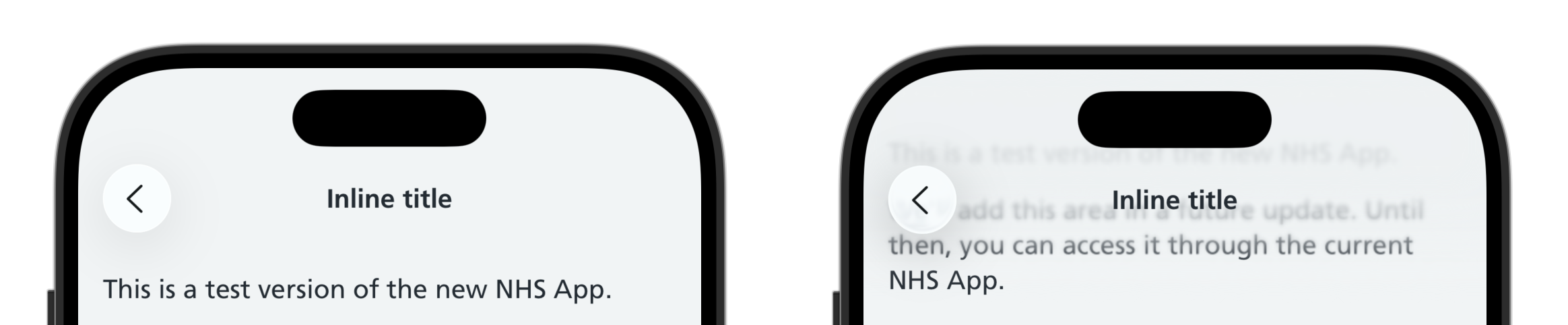
Add displayMode: .inline to the .nhsTitle.
A Title() is not needed in the content.
The inline title must not truncate, because it is the only place the heading appears. Truncation is only acceptable when the inline title is the collapsed form of a large title, where the heading has already been shown in full.
Writing for this component
Keep the heading short and in sentence case, naming what the screen is for.
Use the same words as the link or button the user tapped to get there, so they know they are in the right place.
Use a subtitle only where the heading needs explaining. Keep it to one or two lines.
Follow the NHS content guide for style, voice and tone.
Accessibility
This component supports Dynamic Type, Dark Mode and VoiceOver.
VoiceOver announces the title as a heading, so users can jump straight to it using the headings rotor.
The heading is announced once. While the large heading is on screen, the toolbar copy is hidden from VoiceOver, and it is only announced once the user has scrolled past the heading.
The icon is decorative and is not read out.
Up to iOS 18, the title is also the label of the back button on screens opened from this one, and is what VoiceOver announces for that button. Keeping headings short helps here too.
Research
This component is not yet being used by the live NHS App, but several rounds of research have been done on it.