Buttons
Buttons are used to help users carry out an action.
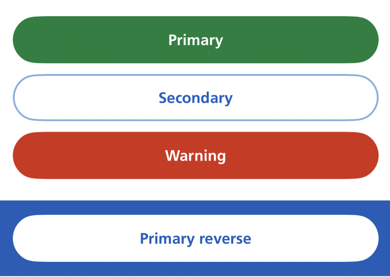
How it works
There are 4 styles:
Follow the NHS design system button guidance for when to use primary, secondary and warning buttons.
By default, buttons stretch to fill the width of their container. Use the fitted modifier to size a button to its label instead.
The button scales with Dynamic Type and adapts to Dark Mode. Text wraps onto multiple lines if needed and is never truncated.
How to use
Use a standard SwiftUI Button and apply NHS styles using the .buttonStyle() modifier.
Swift options
| Option | Description |
|---|---|
.nhsPrimary |
A solid green button for the main action on a screen |
.nhsSecondary |
An outlined blue button for supporting actions |
.nhsPrimaryReverse |
A solid white button with blue text, for use on dark backgrounds |
.nhsWarning |
A solid red button for destructive actions |
.fitted |
Chain onto any preset to size the button to its label instead of filling the container width |
Primary button

Secondary button

Warning button

Primary reverse button

Use this on a dark background, such as the NHS blue:
Fitted width

By default, buttons fill the available width. To size a button to its label, chain fitted:
Grouped buttons

Place buttons side by side in an HStack:
Container-level style
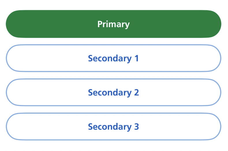
Apply a style to a container to set the default for all buttons inside it. Buttons with their own style override the container:
Accessibility
This component supports Dynamic Type, Dark Mode and VoiceOver.
Disabled buttons fade visually but remain in the accessibility tree, so VoiceOver users know the action exists even when it is not available.
Research
These button styles are not yet being used by the live NHS App, but several rounds of research have been done on them.