Card style
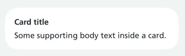
The nhsCardStyle() modifier applies NHS card styling to any view: a padded, rounded background with an optional border.
Components like the banner and campaign card use it.
When to use
Use nhsCardStyle() to build a new card-like container that no existing component covers.
When not to use
Check for an existing component first. Do not use nhsCardStyle() to rebuild something the design system already provides, such as a banner or campaign card. If you find yourself recreating one of these with small changes, propose a change to the component instead.
How to use
Apply the modifier to the outermost view of your card content:
Swift options
| Option | Description |
|---|---|
backgroundColor |
Optional. The card's background colour, white by default. Check your content has enough contrast against it |
borderColor |
Optional. The border colour, .nhsBorder by default. Only visible when borderWidth is more than 0 |
borderWidth |
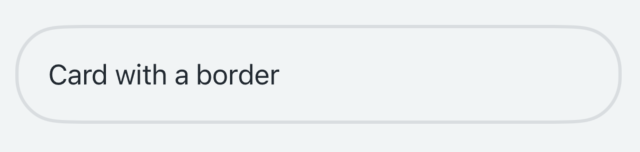
Optional. The border width, 0 by default. Use 2 with a clear background for an outlined card |
paddingVertical |
Optional. The padding above and below the content, the standard NHS card padding by default |
paddingHorizontal |
Optional. The padding either side of the content, the standard NHS card padding by default |
alignment |
Optional. How the content is aligned when it is narrower than the card, leading by default |
nhsCardRowStyle() has no options. Apply it after nhsCardStyle() when placing a card inside a List.
For an outlined card, use a clear background with a border:
To make the whole card tappable, apply the modifier to a Button:
Using a card in a list view
To place a card inside a List, apply nhsCardRowStyle() after nhsCardStyle(). This removes the default row insets, background and separator so the card renders edge to edge rather than as a standard inset row:
Accessibility
The modifier only affects how a view looks. You are responsible for the accessibility of the content used, such as labels, traits and tap target sizes.
When choosing a background colour, check that your text and any accent colours have enough contrast against it to meet at least WCAG AA. The default white background with nhsText meets this.