Move between areas of the NHS App
There are different ways to help people move easily between areas of the NHS App.
Top and bottom navigation bars
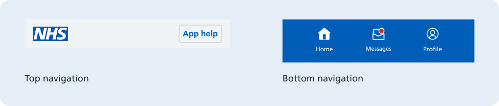
The top navigation allows users to access App help, where users can find help and support information to complete their task. The NHS logo in the top navigation assures users they are in the official NHS App and navigates users home when selected.
The bottom navigation contains the buttons for the three main areas in the NHS App: Home, Messages and Profile, allowing users to easily swap between them. New messages are highlighted by a red badge on the Messages icon. Research shows that some users struggle to notice the bottom navigation, which is one of the reasons why most journeys relating to health related tasks and information are on the home screen.
Screen structure
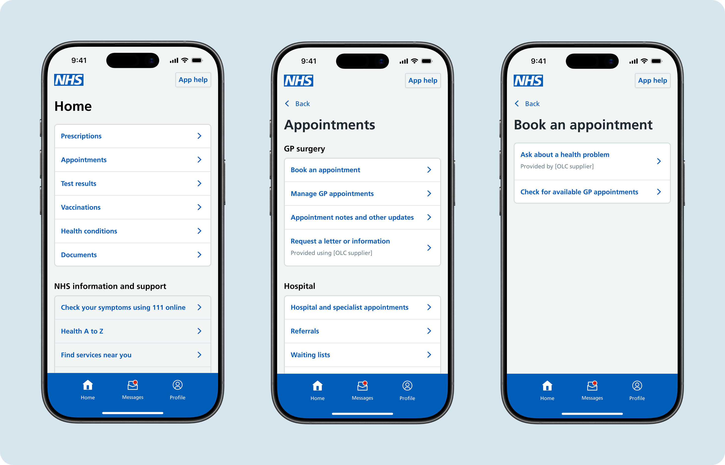
Users do most of their navigation to the start of journeys through hubs and sub-hubs. They are designed to be easy to understand and progress through. These screens are typically made up of a main heading, section headings and card links.
Headings
Headings help users understand what the screen covers and find the information they need. Headings should reflect the screen structure and are particularly important for people with access needs.
Main headings should be unique, informative and concise, and there should only be 1 per screen. In the NHS App, main headings should reflect the link the user clicked when navigating to that screen. For instance, if the user selects an 'Appointments' link, the next screen should have the main heading 'Appointments'.
Sub-headings provide additional structure by creating meaningful groups of card links which help with navigation. The sub-headings used in the NHS App were derived from a combination of the information available across the app and research showing how users group this information. Whilst sub-headings can be useful, too many sub-headings can overwhelm users with choice.
Read more about headings on the NHS digital service manual
Card links
Card links in the NHS App are interactive elements to help users reach the next stage of their journey. Card links take users:
- deeper into an area of the app
- to the start of an NHS App service
At the hub level, card links are mainly used to group information so that users can navigate into deeper areas of the app, like sub-hubs, progressing them towards what they are looking for. This progressive disclosure approach increases usability by only showing users the essential information they need to make a decision at each stage of their journey.
Card link labels should be concise and describe to the user what to expect on the next screen. Sometimes this can be a single word, the name of a service or a short phrase starting with a verb.
Primary and secondary card links are used to communicate hierarchy on a screen. A description can be used on a card link if a user need for more detail has been uncovered.
Related screens
Sometimes users can be helped with their onward journey by presenting them with options to related content.
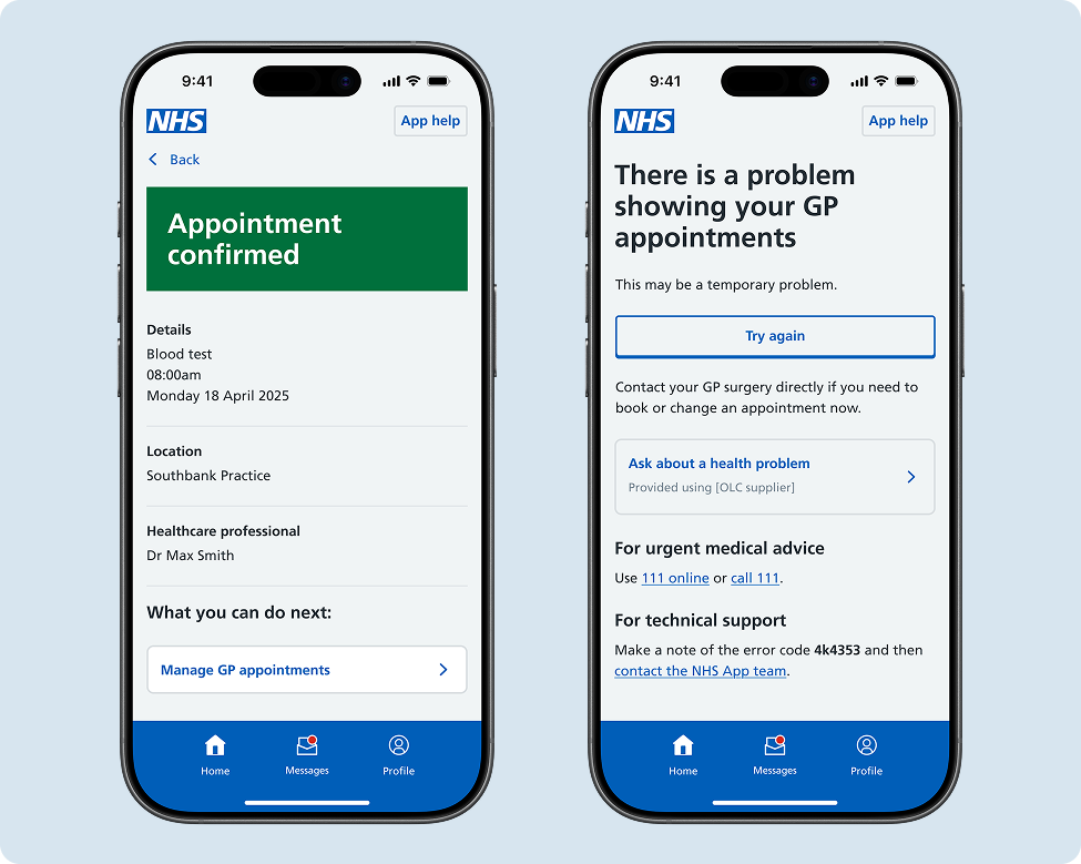
Through research, it has been uncovered that journeys that could benefit from this form of navigation include:
- Start screens where users can either learn more about a service or be directed to another relevant service
- Confirmation screens where users can be directed to helpful information or relevant places they can go next. For example, research showed that users often want to view their list of upcoming appointments after they book an appointment to be certain the booking is confirmed.
- Error screens where users can be shown alternative places they can go to receive similar care options. For example, if there are no appointments available for the user to book directly at their GP, they can be directed to their OLC booking form to ask their GP about a health problem.
Related screen options should be used sparingly such to maintain relevance of the information on screen and to help the user complete their task. Related screen options should never be used to patch poorly performing user journeys by redirecting users to what they might have been looking for. Instead, the design of the core journey should be addressed to increase direct navigational success of the journey, as repeated appearances of options across the NHS App can decrease users navigational confidence.
Help improve this pattern
The NHS App design system team would like to hear:
- how you have used this pattern in your service
- any feedback you have about its usage, for example accessibility or ideas for improvement
Add these comments to the 'Move between areas of the NHS App' discussion on GitHub.