Bottom navigation
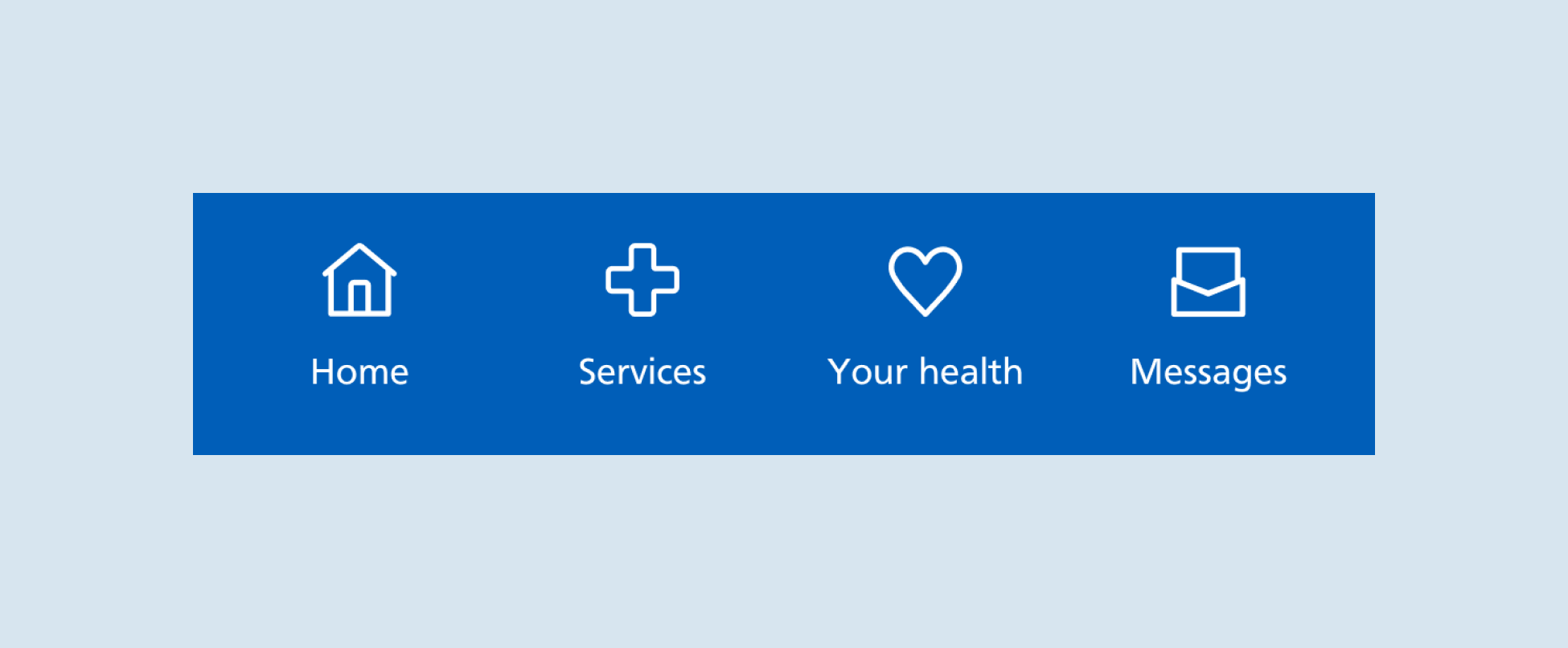
The bottom navigation helps users return to the homepage or move to a hub page.

When to use
The bottom navigation is visible at the bottom of most pages in the NHS App. The exception is when external pages open in a web browser overlay.
The top navigation remains fixed in position as users scroll.
When not to use
The bottom navigation is not part of the web browser version of the NHS App. The same links are contained within an NHS.UK header instead. The bottom navigation is also not visible when external content is opened in a browser overlay within the NHS App, for example if a user navigates to the help and support pages hosted on the NHS website.
How to use
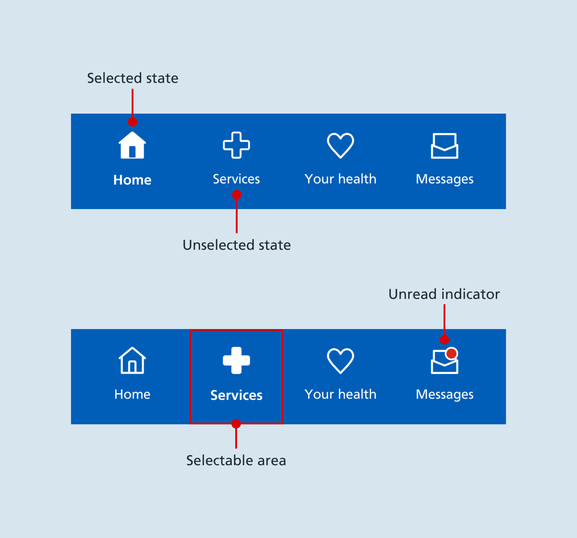
Each hub is represented by a text label and an icon. The text labels match the main heading on the respective hub page.

Accessibility
Bear in mind that the bottom navigation can be easier for users to reach than the top navigation. This lends itself to links that users may need more frequently.
Research
The ‘Home’ link was previously placed on the top navigation of the NHS App. In usability testing, participants found it easier to use the link when it was placed on the bottom navigation. They also noticed that this placement was more consistent with other popular apps.
We also tested recognition of the hub page icons. The icons were well recognised. The use of text labels was needed to help users differentiate the ‘Services’ and ‘Your health’ icons.
Help improve this component
The NHS App design system team would like to hear:
- how you have used this component in your service
- any feedback you have about its usage, for example accessibility or ideas for improvement
Add these comments to the 'Bottom navigation' discussion on GitHub.