Badge
Use badges to alert users to unread information. Badges can include a number count.
When to use
Badges can be placed:
- on the edge of an icon
- on a card
Badges help to notify users about unread information that needs their attention. This could include new messages or new documents.
How to use
Badges should be dynamic and temporary. After users have viewed the relevant information, badges should either:
- disappear
- remain if there are still unread items (but with an adjusted number count, if one is used)
Large badges
Large badges always include a number count. This tells users how many items need their attention.
Nunjucks macro options
Use options to customise the appearance, content and behaviour of a component when using a macro, for example, changing the text.
Some options are required for the macro to work; these are marked as "Required" in the option description.
If you're using Nunjucks macros in production with "html" options, or ones ending with "html", you must sanitise the HTML to protect against cross-site scripting exploits.
| Name | Type | Required | Description |
|---|---|---|---|
| count | number | yes | Number for the large badge. Badge appears only when count > 0. |
| label | string | yes | Visually hidden text read after the number (for example new messages). |
| id | string | no | ID attribute for the badge. |
| classes | string | no | Classes for the badge. |
| attributes | object | no | HTML attributes for the badge (e.g. data-*, aria-*). |
To use the component in your design, add the NHS App Figma library to your working files, and navigate using the components tab.
To use the component in your Vue application, install the NHS App Vue Component Library and import the component.
Above the count of 9, large badges always display 9+. This allows the width of the badge to be restricted to two characters.
Nunjucks macro options
Use options to customise the appearance, content and behaviour of a component when using a macro, for example, changing the text.
Some options are required for the macro to work; these are marked as "Required" in the option description.
If you're using Nunjucks macros in production with "html" options, or ones ending with "html", you must sanitise the HTML to protect against cross-site scripting exploits.
| Name | Type | Required | Description |
|---|---|---|---|
| count | number | yes | Number for the large badge. Badge appears only when count > 0. |
| label | string | yes | Visually hidden text read after the number (for example new messages). |
| id | string | no | ID attribute for the badge. |
| classes | string | no | Classes for the badge. |
| attributes | object | no | HTML attributes for the badge (e.g. data-*, aria-*). |
To use the component in your design, add the NHS App Figma library to your working files, and navigate using the components tab.
To use the component in your Vue application, install the NHS App Vue Component Library and import the component.
Small badges
Small badges are simple circles. They can be placed:
- on the edge of icons, such as on the bottom navigation
- on cards, alongside text, such as “Document attached” on appointment cards
Use the color option to set the indicator colour. Small badges default to red.
If not already existing, create an associated CSS class for each colour:
.nhsapp-badge-small__indicator--warm-yellow {
  background-color: nhsuk-colour("warm-yellow");
}

.nhsapp-badge-small__indicator--aqua-green {
  background-color: nhsuk-colour("aqua-green");
}Nunjucks macro options
Use options to customise the appearance, content and behaviour of a component when using a macro, for example, changing the text.
Some options are required for the macro to work; these are marked as "Required" in the option description.
If you're using Nunjucks macros in production with "html" options, or ones ending with "html", you must sanitise the HTML to protect against cross-site scripting exploits.
| Name | Type | Required | Description |
|---|---|---|---|
| text | string | conditional | If html is set, this is not required. Text to use within the badge component. If html is provided, the text argument will be ignored. |
| html | string | conditional | If text is set, this is not required. HTML to use within the badge component. If html is provided, the text argument will be ignored. |
| label | string | yes | Visually hidden accessible text before the text (for example New). |
| color | string | no | Defaults to red. Built-in variants: warm-yellow, aqua-green. Adds nhsapp-badge-small__indicator--{color} class to indicator. |
| positionAbsolute | boolean | no | When true adds the nhsapp-badge-small--absolute class so the indicator is absolutely positioned relative to the badge wrapper. |
| id | string | no | ID attribute for the badge. |
| classes | string | no | Classes for the badge. |
| attributes | object | no | HTML attributes for the badge (for example data-* or aria-*). |
To use the component in your design, add the NHS App Figma library to your working files, and navigate using the components tab.
To use the component in your Vue application, install the NHS App Vue Component Library and import the component.
We show a red badge on the bottom navigation to indicate unread messages.
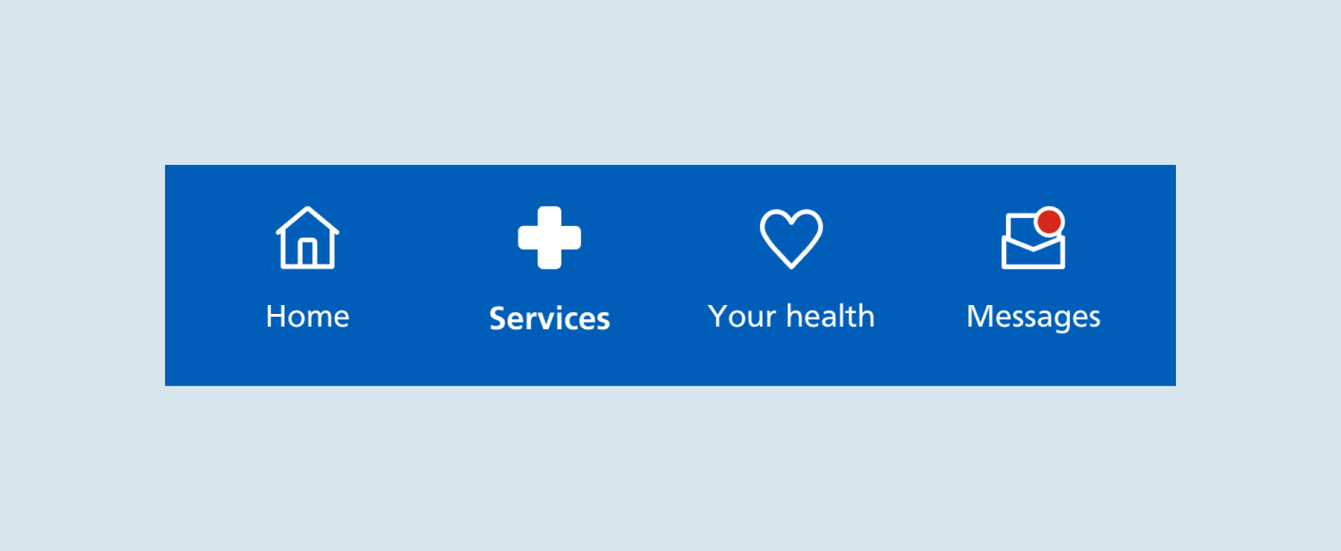
When users then navigate to their messages inbox to view those messages, unread message headings are indicated by red badges.
Nunjucks macro options
Use options to customise the appearance, content and behaviour of a component when using a macro, for example, changing the text.
Some options are required for the macro to work; these are marked as "Required" in the option description.
If you're using Nunjucks macros in production with "html" options, or ones ending with "html", you must sanitise the HTML to protect against cross-site scripting exploits.
| Name | Type | Required | Description |
|---|---|---|---|
| title | string | conditional | The card title text. Renders as: link (if href), heading (if headingLevel and no href), else a paragraph. Ignored if titleHtml is given. |
| titleHtml | string | conditional | HTML title (allows markup). Overrides title. |
| href | string | conditional | Makes the title a link when provided. |
| linkAriaLabel | string | no | aria-label for the title link. Use only if the visible text is not clear. |
| headingLevel | number | conditional | Heading level (2–6) used only when there is no href. If not set (and no href) the title is a paragraph. |
| titleClasses | string | no | Classes for the title element. |
| containerClasses | string | no | Classes for the inner container. |
| description | string | conditional | Plain text description below the title. Ignored if descriptionHtml is given. |
| descriptionHtml | string | conditional | HTML description (allows markup). Overrides description. |
| descriptionClasses | string | no | Classes for the description. |
| aboveContent.html | string | no | HTML shown above the title (for example a tag). |
| footer.html | string | no | HTML shown in the footer. |
| img{}.src | string | conditional | Image URL. Adds an image section when present. |
| img{}.alt | string | no | Image alt text. Leave empty only if purely decorative. |
| badgeLarge{}.count | number | conditional | Number for the large badge. Badge appears only when count > 0. |
| badgeLarge{}.label | string | yes | Visually hidden text read after the number. |
| badgeLarge{}.id | string | no | ID attribute for the badge. |
| badgeLarge{}.classes | string | no | Classes for the badge. |
| badgeLarge{}.attributes | object | no | HTML attributes for the badge (e.g. data-*, aria-*). |
| id | string | no | ID for the card. |
| classes | string | no | Classes for the card. |
| attributes | object | no | HTML attributes for the card (e.g. data-*, aria-*). |
Accessibility
Badges are designed to stand out when placed over icons and cards. The contrast ratio is 3:1, meeting WCAG 2.2. Contrast (Minimum) (Level AA).
We use visually hidden text to convey badges to screen reader users. Large badges announce the number count up to 9. They announce "nine plus" after that to match the visual display of 9+.
Small badges could announce "New notification", "Important" or "You have unread messages" depending on the context.
Help improve this component
The NHS App design system team would like to hear:
- how you have used this component in your service
- any feedback you have about its usage, for example accessibility or ideas for improvement
Add these comments to the 'Badge' discussion on GitHub.